Colorverse - Tang Pyeong [탕평]
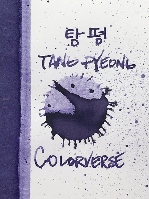
Colorverse - Tang Pyeong - Ink drop
Tang Pyeong or 탕평 (pronounced Tahng-Pyung) is from Colorverse’s Project, Vol.3, Kingdom series. It’s from the six-ink first set released in late 2022. They’ve since added a second set.
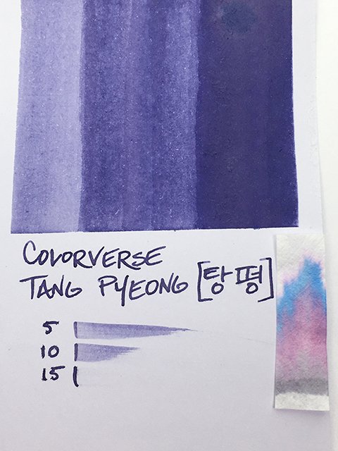
Colorverse - Tang Pyeong - Color Range
Tang Pyeong means harmony. In the early 18th century, King Yeongjo enacted his Tang pyeong policy of appointing officials in equal numbers from each political policy in order to prevent factionalism and conflict in governing. He believed factionalism had the potential to destroy a society or nation. (How relevant to today’s world!)
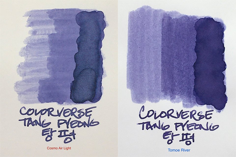
Ink Swatches on Cosmo Air Light and Tomoe River
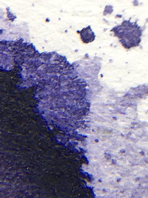
At its base, Tang Pyeong is a mid-to-deep violet. Like the other inks in the original release in the series that I’ve tried, there is a powdery, pastel aspect to the ink. This gives it a weathered, aged feel, much like the paint on a centuries-old temple.
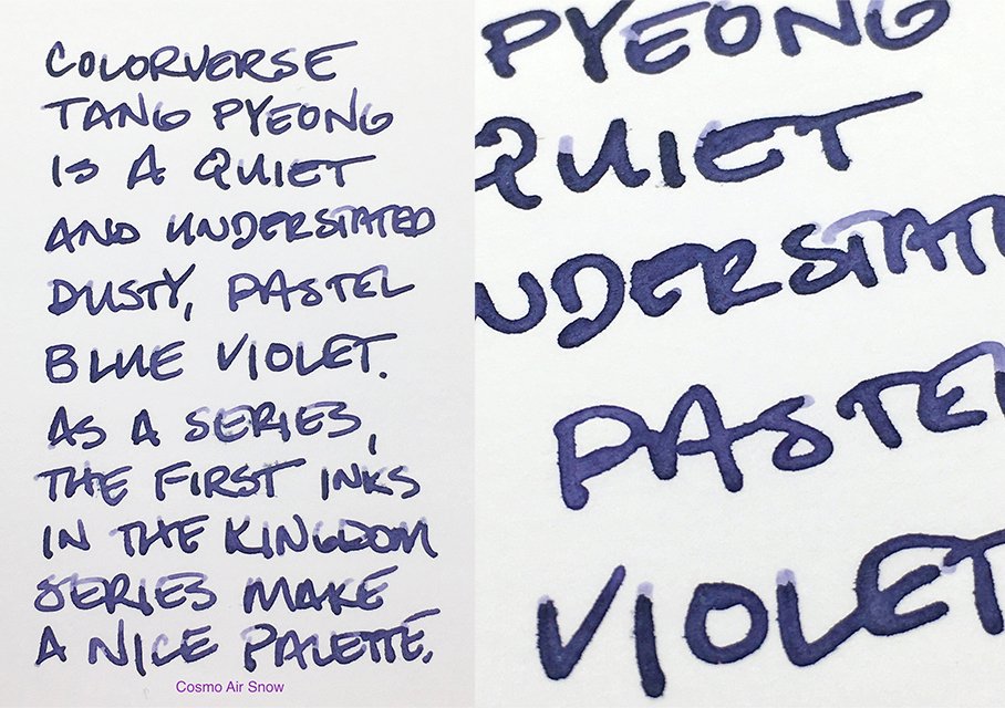
Amazing Shading on Cosmo Air Snow!
This is the powdery blue violet of ripe blueberries. When you get shading, light areas show off the subtle pink influences, and it leans more violet than blue. It isn’t the strongest shader, but there is gentle, natural variation on uncoated papers, and less frequent, but sharper variation on coated papers.
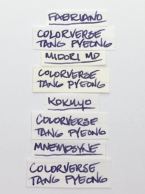
Colorverse - Tang Pyeong - Writing Samples
In writing, this ink performs well. It’s not the wettest ink, but it isn’t really dry, either. Flow was comfortable with a slight feel that isn’t unpleasant. On all higher-quality papers tested, strokes were clean and sharp. On cheap copy paper, there was a bit of spread, but no feathering. On uncoated papers, there’s some show-through, but not as much as I expected for such a color. Drying ranged from fairly fast to slightly longer than average. Overall, this is a very good writing ink.
Colorverse - Tang Pyeong - Swatch Card
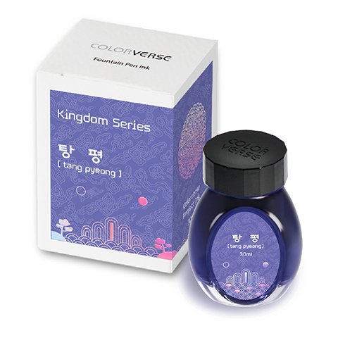
I don’t normally go for powdery, dark violets, but as a series, these inks make a fantastic, deep pastel palette. I think Tang Pyeong would make a great office ink, too. You can find it for US$15 in 30 ml bottles, and the packaging and labeling are elegant and beautifully done.
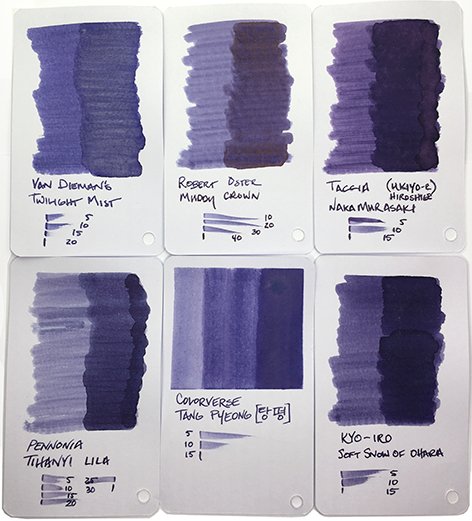
Colorverse - Tang Pyeong - Comparisons
Colorverse - Tang Pyeong - 30 ml Bottle and Box

