Herbin - Vert de Gris
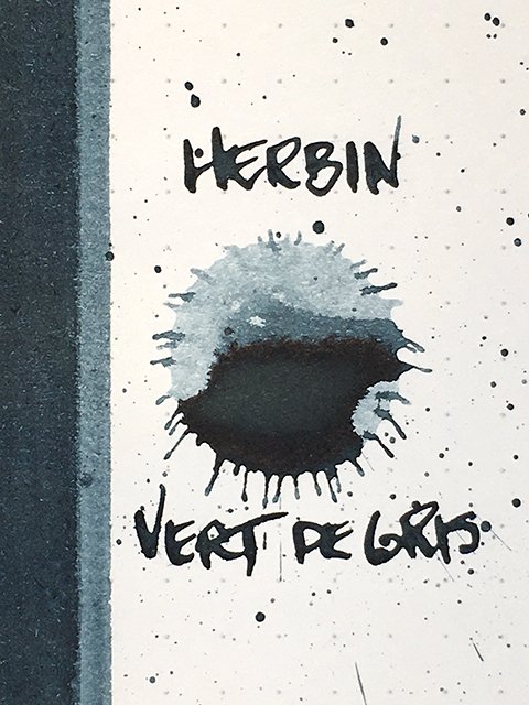
Herbin - Vert de Gris - Ink Drop
I haven’t used any of my Herbin (or J. Herbin as the line was formerly branded) inks. I don’t know why, but I’d kind of shied away from them for some reason. I was given a bottle of Herbin Vert de Gris a couple of months ago, and I inked up a pen the other day. In an instant, I remembered just how good many of their inks can be. Vert de Gris is a great example of an ink that simply does exactly what it’s supposed to do, and as we know, that isn’t always guaranteed when you try out an ink that’s new to you!
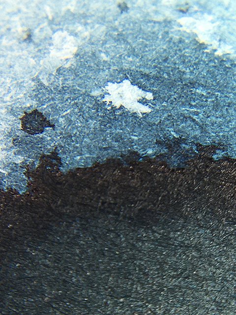
Herbin - Vert de Gris - on Cosmo Air Light
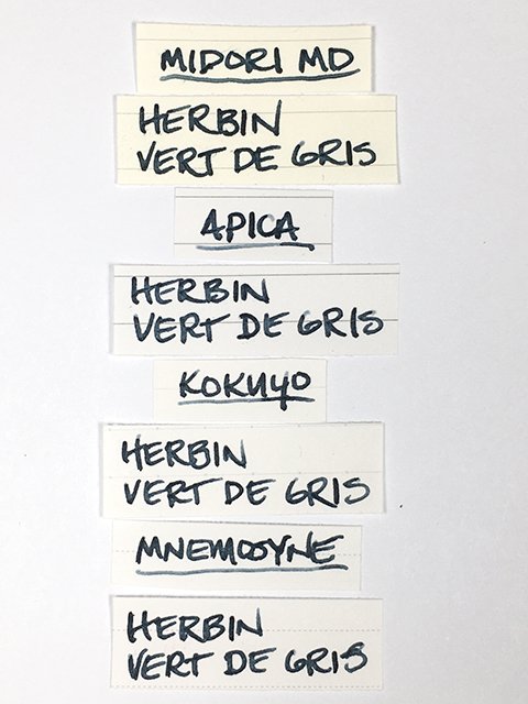
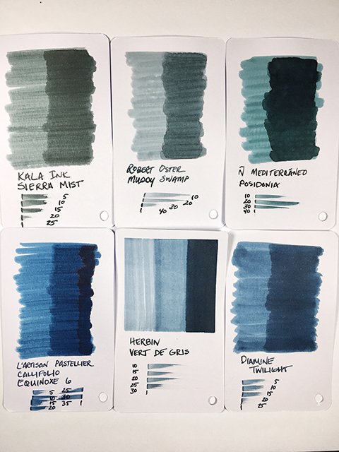
Herbin Vert de Gris (greenish grey) has far less green than the name suggests. That isn’t to say that there aren’t green influences, but I see it much more as a blue grey, than a greenish grey. I tried it on a bunch of different papers and there are slight variations from one to the other. On some, you don’t really feel the yellow influences much at all. On others, it’s much more clearly playing a role and makes it a greenish-blue grey. In the swatch card comparisons below, I show it next to some similar green grey and blue greys.
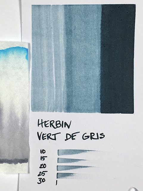
Herbin - Vert de Gris - Color Range
Strokes were darker on some, and a bit lighter on others. From time to time, there are letters that shade lighter at the beginning of the stroke. You can see a few letters with shaded ends in the writing samples image further down in this review. I expected a lot more shading than I found, and I don’t really consider this a shading ink at all, and that’s fine. What it is, though, is a very nice writing ink.
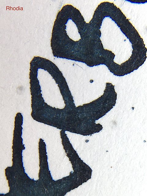
Herbin - Vert de Gris - on Rhodia
This is a writer’s ink. Neither wet, nor dry, it’s a very nicely balanced ink in flow and very comfortable in use. On all papers tested, strokes were clean and sharp with no feather or spread in the slightest. Drying was fast on uncoated papers, and more towards the average on coated papers. Drying time was in that happy range on all. It’s not waterproof, but water-resistance was good, too.
Herbin - Vert de Gris - Writing Samples
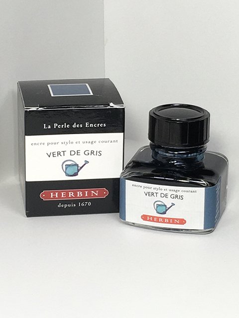
I picked up the 30 ml bottle, but it’s also available in the little 10 ml bottles, as well. The 30 ml bottle is the traditional style that they’ve been using for many, many years. It has a pen rest on the top front of the bottle, but with modern pen sizes, I’ve never found it very useful. It has a nostalgic feel, though, and I like that they still include it in the design.
Herbin - Vert de Gris - Ink Swatch Card
Herbin inks are always nicely priced, and I think Vert de Gris is an ink that many people will appreciate. It isn’t the kind of color or effect that is going to take your breath away, but it’s nice. I think it’s one of the better inks in the series in term of writing performance, too. The 30 ml bottles are very affordable, and the 10 ml bottles make it easy to try a few without thinking about the cost. The choice is yours.
Keep scrolling down for swatch card comparisons, and the 30 ml ink bottle.
Herbin - Vert de Gris - Swatch Comparisons
Herbin - Vert de Gris - 30 ml Ink Bottle and Box
