Ink Institute - Cat at Noon
Ink Institute Cat at Noon - ink drop
This is the second ink in the four-ink Cat series from Ink Institute. Called Cat at Noon, this ink has all of the passion and chaos of two cats and a loose ball of string, and that’s exactly the image on this beautifully presented ink’s label. The brand’s labels often feature original art created using the ink itself.
Ink Institute Cat at Noon - color and edge
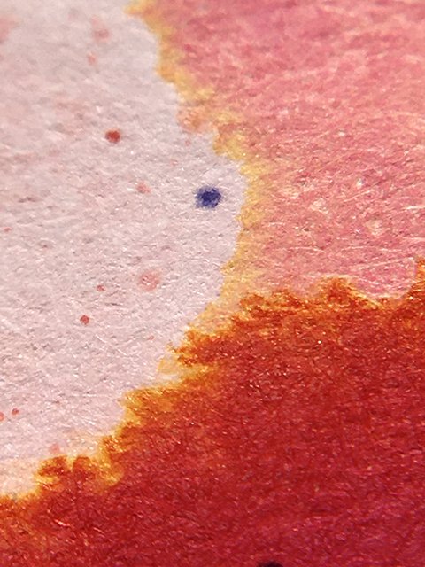
Visually, this is an extremely interesting and unusual ink, and it’s equally beautiful! At its base, we have a gorgeous blush coral. However, this is a very complex ink, with layers and layers of undertones that blend and swirl. On coated papers, it’s a heavy shading ink with aggressive jumps between light yellow-pinks and dark orange-reds. The splatter shows a powdery pink center that deepens towards the edges, before morphing into yellows, oranges, and salmon pinks of varying shades and intensities.
Ink Institute Cat at Noon - a beautiful blend of colors!
The show continues in written strokes, with all the color and drama promised. It’s a wet ink, but it acts more neutral in use. Strokes were razor sharp and clean. Drying was slightly long at 20-25 seconds on coated papers, 15 seconds on uncoated premiums, and under 5 seconds on office copy. It’s probably too delicate for long writing and reading, but it’s very usable, overall.
Ink Institute Cat at Noon - ink swatch card
This is a very unusual ink, different from many of the other popular polychrome inks. It’s quite beautiful, and I don’t know of anything really similar overall. It’s probably not the most practical, but it’s a beautiful ink in writing, and I think it has unlimited creative potential. You’ll love playing with Ink Institute’s Cat at Noon!
Ink Institute Cat at Noon - a fiery halo!


