
Callifolio - Gris de Payne
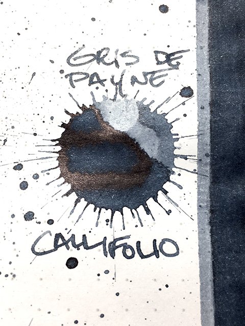
Callifolio - Gris de Payne - ink drop
This is Gris de Payne, another beauty from L’Artisan Pastellier’s Callifolio series. The boutique ink maker, based in Albi, France, creates the mixable Callifolio inks from natural pigments and dyes.
Gris de Payne, or Payne’s Grey is a traditional dark blue grey used in painting, and commonly used as a mixer in place of black. The color is named for William Payne, the 18th century English watercolorist who first developed and popularized it. The final image below gives a classic example.
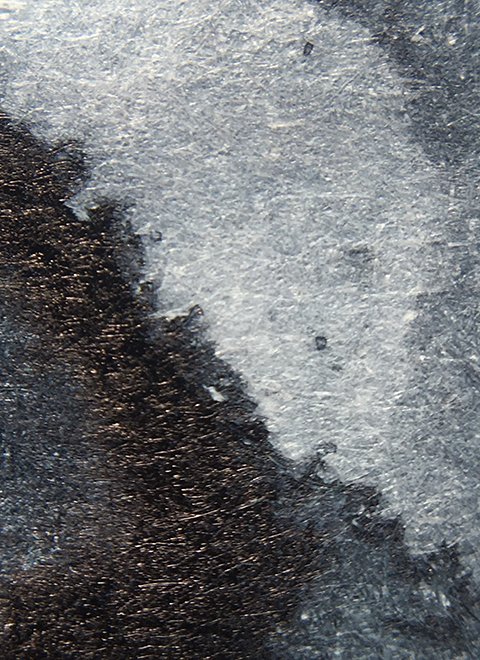
Callifolio - Gris de Payne - Beautiful moody tones!
Visually, it’s a dark, midnight blue-grey base color. The color is beloved for its ability to convey weather, shadow, and mood. It’s been called both the color of English rain, and the color of malaise. This is a moderate shading ink, with a soft, yet wide range of lights and darks. There’s often a subtle edge halo, which adds depth and definition. It’s really quite a beautiful ink.
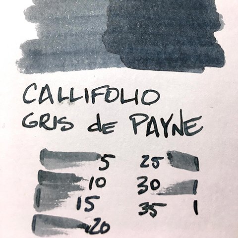
Callifolio - Gris de Payne - ink swatch card
As a writing ink, Gris de Payne remains true to the Callifolio line, and performs extremely well. Neither too wet, nor too dry, it has a nice even flow. There’s a good level of water-resistance, too. Strokes were sharp, and well-defined on all papers tested. Shading and halo were more pronounced on coated papers. While shading showed on all tested, halo was absent from office copy. Drying was quick, with coated papers at 10-15 seconds, and both uncoated premiums and office copy at 5-10 seconds.
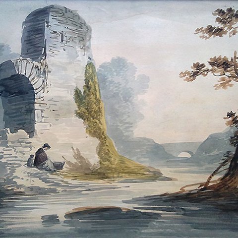
Callifolio - Gris de Payne - A classic example!
This is a lovely ink, filled with character. It’s a great writing and reading ink, too! I continue to be impressed by the Callifolio inks. They’re one of the best bargains on the market. I definitely recommend Gris de Payne.