
Herbin - Rouge Opera
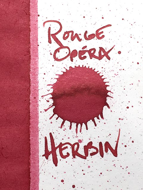
Herbin - Rouge Opera - ink drop
I chose today’s ink, Herbin’s Rouge Opéra to compare and contrast with the my review of Rouge Caroubier, another red in their standard lineup. They feel somewhat similar, but as you can see below, the two are really quite different. To my eye, both are very attractive.
Herbin - Rouge Opera - an unusual red!
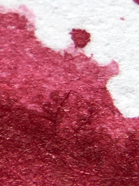
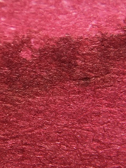
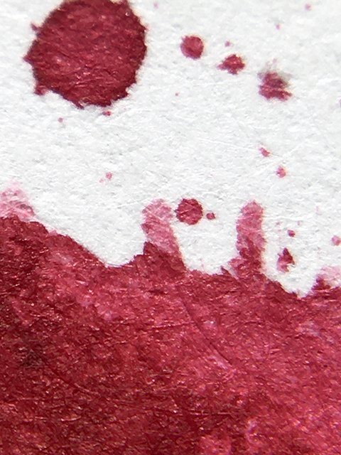
Rouge Opéra is often referred to as a pink, but I’m not sure that is really what first comes to mind. I see it as a dusty, medium red with strong influences of both pink and plum red. It’s a decent shading ink and shows both light and dark areas in written strokes. As splatters dried, I expected a bit of sheening to develop, but didn’t find any at all. It contrasts very nicely off the page and is easy on the eye.
Herbin - Rouge Opera - medium to dark
This is a nice writing ink. It’s fairly wet, flows smoothly, and drying times are quite nice. It dries much faster than expected, given its light consistency. It’s well-behaved, too. There’s no feather on friendly papers. It loves coated papers, but it doesn’t do as well on cheaper copier papers.
Herbin - Rouge Opera - some end shading
I think you’ll enjoy Rouge Opéra. Like many of the standard Herbin inks that I’ve tried, it’s a nice option in a drier writing pen. The 30ml bottles have a classic, traditional design, but I usually go for the 10ml bottles in the standard line. They’re both inexpensive, but the 10ml bottles make it easier to try a number of colors without considering the cost. Enjoy!
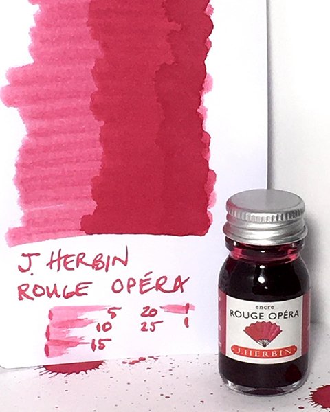
Herbin - Rouge Opera - ink swatch card and bottle
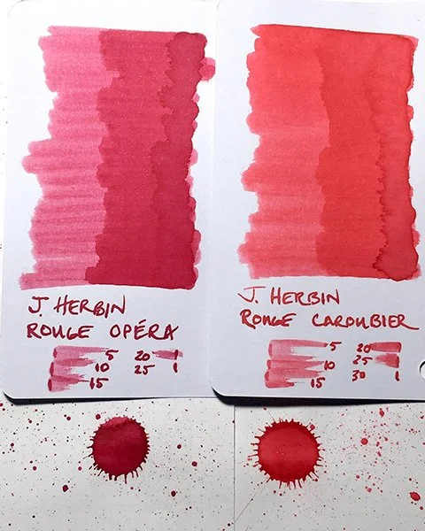
Rouge Opera and Rouge Caroubier ink swatch comparison