
Wearingeul - Don Quixote
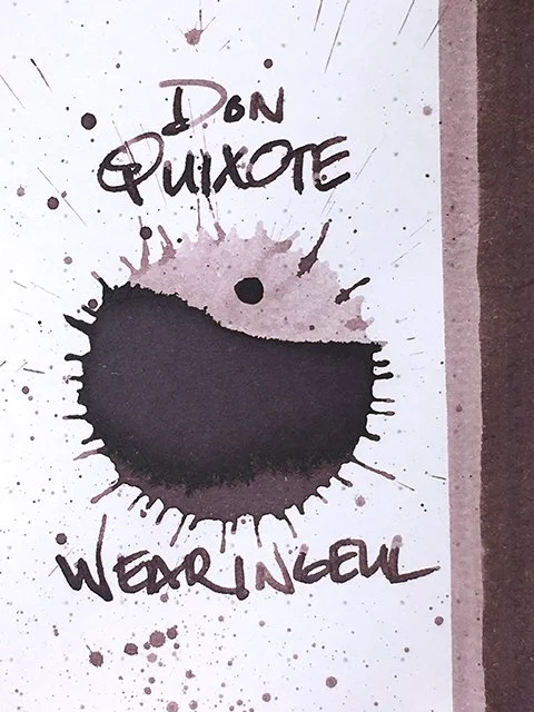
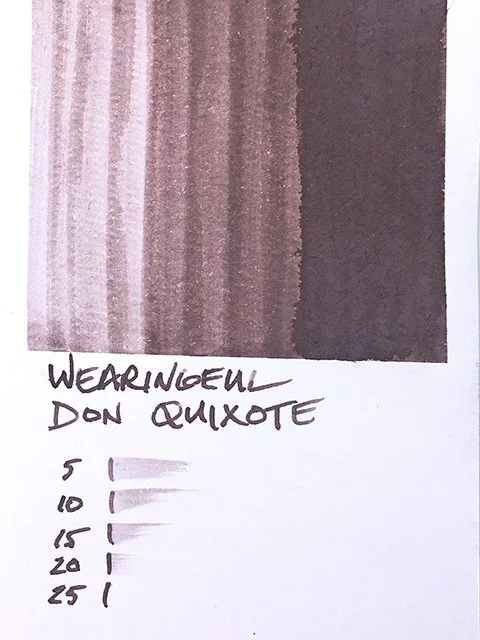
Wearingeul Don Quixote - Ink drop
Wearingeul’s Don Quixote is interesting and confusing at the same time. It’s hard to categorize and quite difficult to describe. I love it on some papers, not as much others. All images have been corrected to reflect the color of the ink as I see it in front of me.
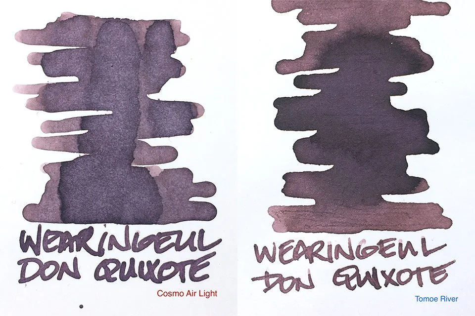
Ink Swatches on Cosmo Air Light and Tomoe River
Don Quixote is a man of many masks. Brown, sepia, plum purple, reddish brown, it really changes depending on the paper you use it with. I absolutely love the deep red brown with a hint of purple that I find on the Takasago Bank paper from Yamamoto. It sits more in the dark browns with just a hint of red on Tomoe River. On Cosmo Air Light and Iroful, I’d call it a plum. On both CAL and Iroful, there’s an unusual greyish dusting that I wouldn’t call beautiful, but it’s oddly appealing. There’s also some nice shading at times, too. This is really an unusual ink.
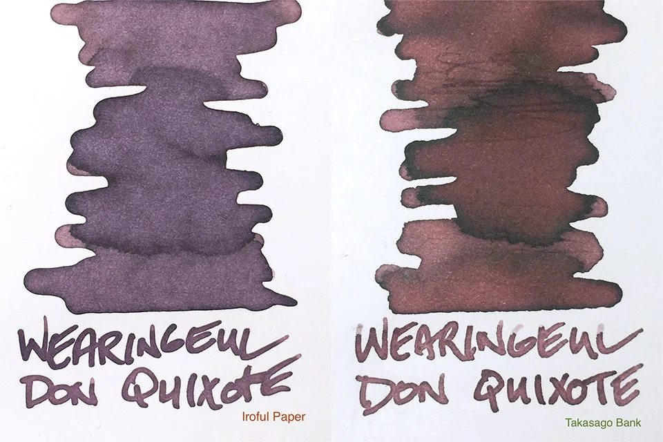
Ink Swatches on Iroful and Takasago Bank papers
Performance was very reliable and comfortable on most papers. In those cases, strokes were mostly crisp and clean. On a couple of papers, results were just the opposite. As you can see, it didn’t play well with Oasis, and I occasionally noted small eruptions within the paper on Cosmo Air Snow. In all cases, flow was neutral to wet and very comfortable in writing.
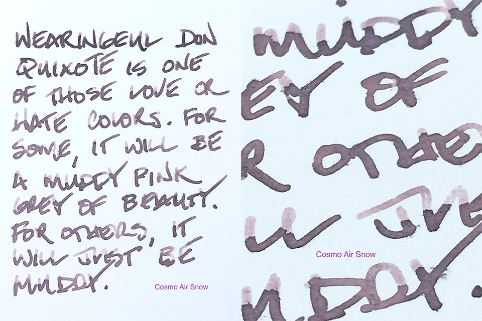
Writing sample on Cosmo Air Snow paper
I’m always interested in unusual colors, and Wearingeul’s Don Quixote is certainly that! I think some will love it, and others will likely not. My bottle is a 10 ml bottle that I got at a Wearingeul pop-up store, but they normally sell it in their standard 30 ml bottle. All-in-all, if you like the look, I think you’ll probably enjoy having it.
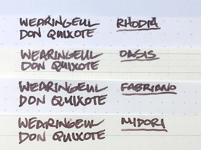
Wearingeul Don Quixote ink writing samples
Wearingeul Don Quixote - Swatch Card
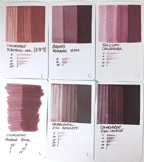
Wearingeul Don Quixote - Comparisons
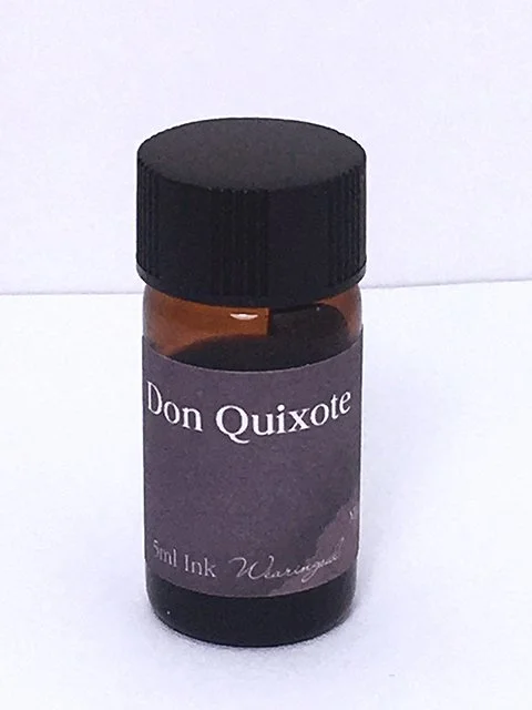
Wearingeul Don Quixote 5 ml bottle