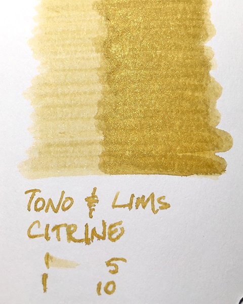
Tono & Lims - Citrine
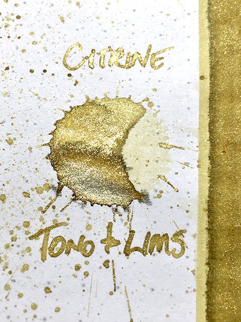
Tono & Lims - Citrine - Ink drop
Today’s ink is a delicate beauty, that’s a little rough around the edges. Our ink today is Citrine from Tono & Lims Earth Contact series. Citrine is a transparent variety of quartz ranging from pale yellow to orange to deep amber brown. It’s a commonly found gemstone, and is popular for jewelry.
Tono & Lims - Citrine - Shading and Shimmer
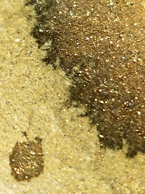
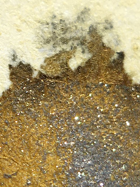
Visually, this is a perfect celebration ink. In writing, it’s a soft, champagne yellow with an aggressive grey and gold shimmer. The shimmer coats everything except stroke tails, which shade light and provide beautiful contrast accents. The splatter shows pale yellow light areas, dark edging, and the heavy shimmer, with patches of silver-grey in areas of pooling. There is a strange grey-black leeching that forms micro-webbing and branching from the edges of pooled areas. Unfortunately, as you can see on the swatch card, this can occasionally be seen in writing, as well.
Tono & Lims - Citrine - Edging
In general, this ink performed well in writing. Strokes were mostly clean and sharp. It’s a heavy shimmer ink, so shading is largely obscured, but stroke tails shade light on all papers. There is a nicely defining halo on premiums, too. This ink is fairly wet, but you need to be careful with such concentrated shimmer. Drying was 20-25 seconds on premiums, and under 5 seconds on office copy.
Tono & Lims - Citrine - Ink Swatch Card
Tono & Lims Citrine is a gorgeous, fun ink, but I don’t like the grey-black leeching. It doesn’t occur very frequently, but it’s distracting and messy, when it does. If you use it with the right papers, it’s a beautiful ink. Tono & Lims inks can be a bit difficult to find in some parts of the world, but they’re always worth the effort, and Citrine is just one in a huge catalogue of options!
