
Dominant Industry - Maple
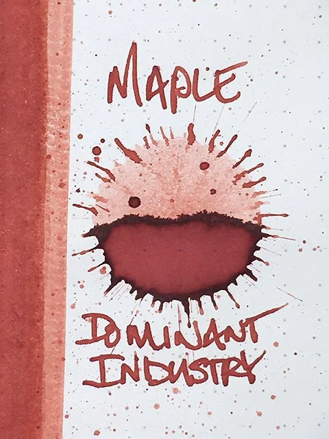
Dominant Industry Maple - Ink drop
I’d wanted to get a bottle of this ink since it first came out, but I kept forgetting to include it in my purchases. Well, waiting in the long, winding line to browse Dominant Industry’s tables at the Autumn 2025 Seoul pen show gave me the chance to remember it, and I’m glad that I did! This is Maple, number 108 in Dominant Industry’s standard collection.
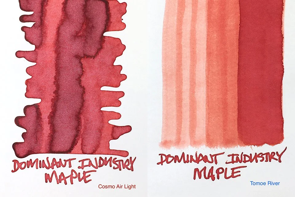
Dominant Industry Maple Ink Swatch on Cosmo Air Light and Tomoe River Papers
Red is one of those colors that is rarely good at keep its secret. Once dry, it immediately reveals whether its loyalties lie with House Orange or House Pink. The quest for the perfect and true red is a saga, not a short story, but it isn’t a thankless obsession. Maple is a beautiful red with many of the qualities that I look for. It may not be neutral, middle red, but I’m not disappointed at all.
As the swatches and writing samples show, yellow undertones influence the final result in varying degrees from paper to paper. I really like the cool, richness and depth of color on the Cosmo Air Light and Iroful swatches. In writing, this is what you can expect most often.
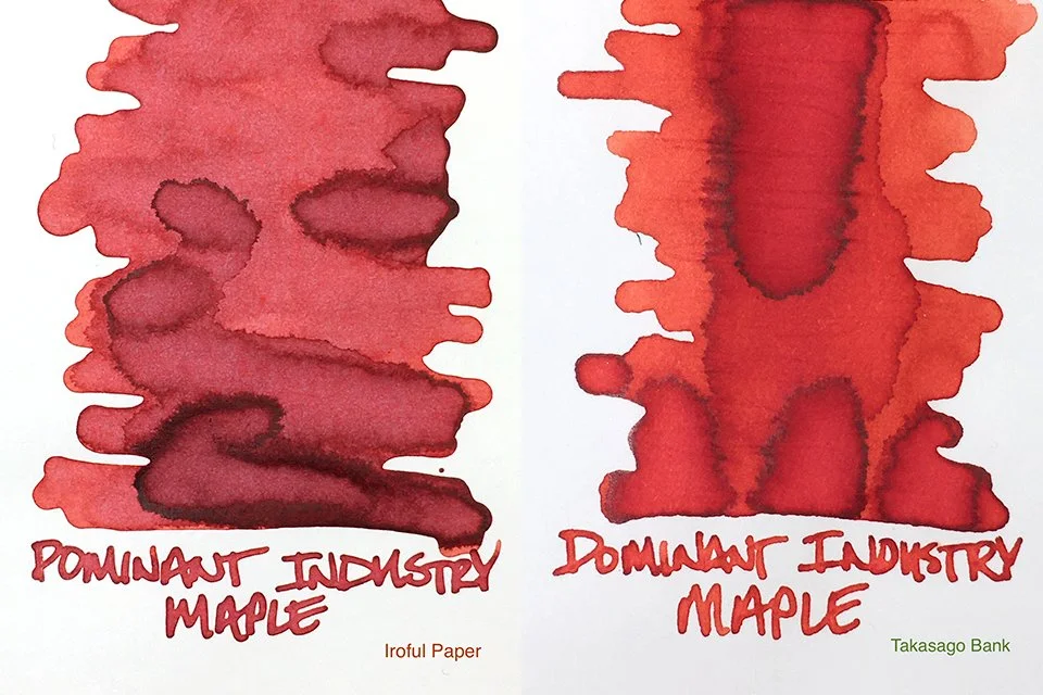
Dominant Industry Maple Ink Swatch on Iroful and Takasago Bank Paper
In writing performance and experience, Maple is exactly what I like. It’s fairly wet in flow and extremely comfortable in feel. There is more shading than you might first imagine, too. Feathering is not a concern. The strong stroke profile edging keeps writing crisp, clean, and sharp on all of the papers I tested.
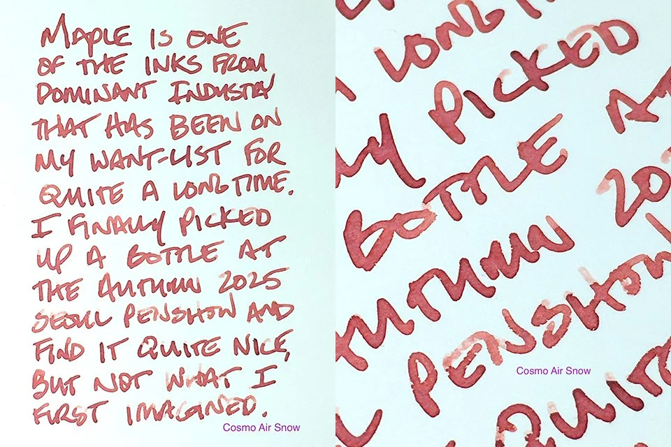
Dominant Industry Maple Ink Writing Sample
Dominant Industry’s Maple provides a lot to love. I think the name matches the color quite well. Although the swatches highlight hints of yellow, it’s actually darker than middle red in writing. The cool tones really balance it out nicely. I’m sure this is a red that many will enjoy as much as I do!
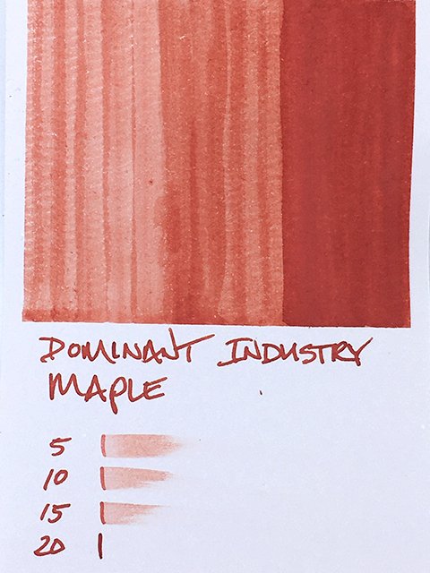
Dominant Industry Maple Ink Swatch Card
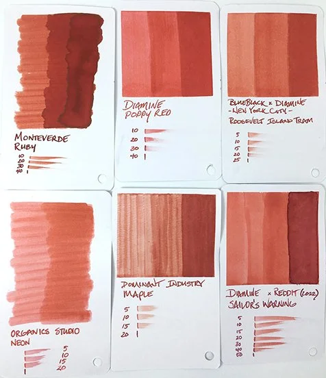
Dominant Industry Maple Swatch Card Comparisons
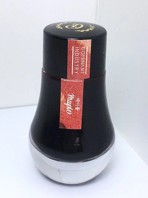
Dominant Industry Maple - 30 ml Bottle